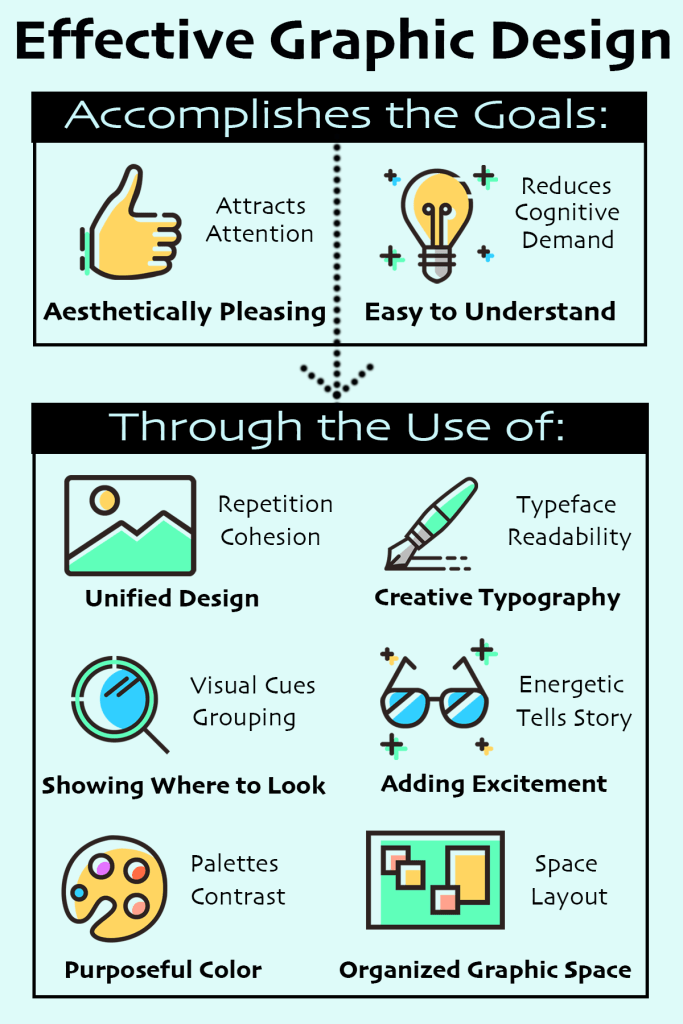
I created the above concept map to both describe and utilize several components of effective graphic design. First I focused on the main goals, which is creating aesthetically pleasing images that are at the same time easy to understand and get the point across. I added an arrow to direct the eye to the next part, ways of accomplishing those goals. This was organized into 6 main categories with some key words thrown in. I used some PNG images from a pre-made collection in an effort to add interest and promote unity between the different topics. I then used a light colored background in the same color palette as the images, again to promote a unified design. Overall I think this concept map is informative and attractive without getting too cluttered or cognitively overwhelming.
