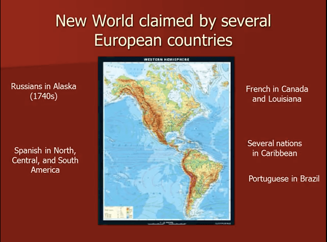
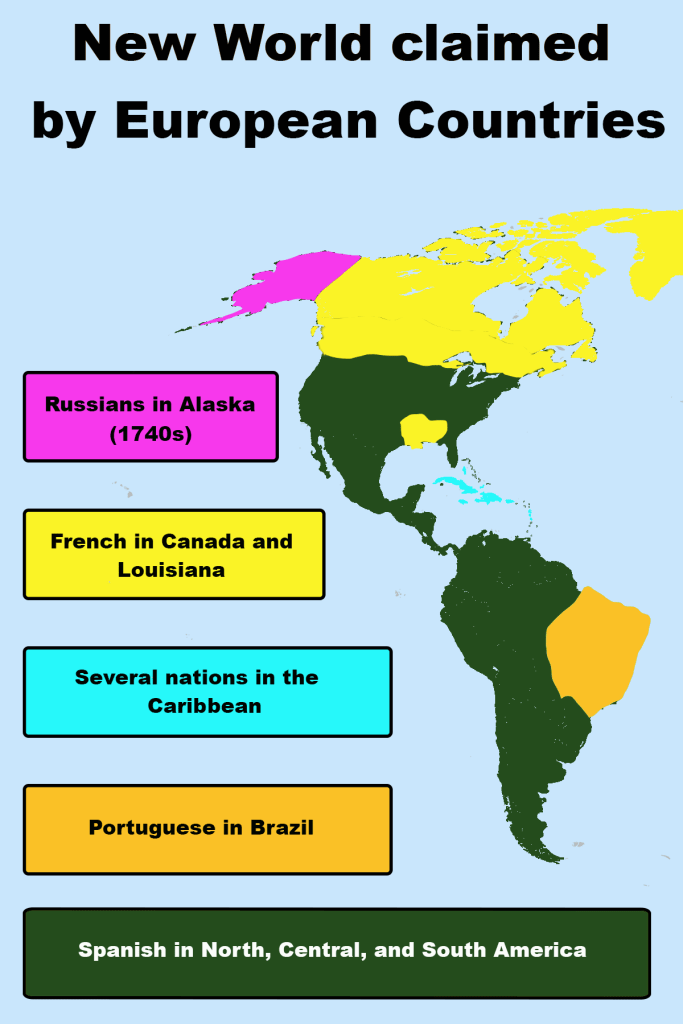
I chose the before image because I felt the content was describing certain natural groups (the European countries claiming North and South America). However in the before image there is no method of grouping (proximity, similarity, boundaries, etc) that helps make the information clear. Even the inclusion of the map does not help make connections with the text. In the after image, I decided I would also use a map, but I would incorporate the idea of boundaries by grouping the different countries with the areas on the map that they claimed. In addition, I used similarity by using the same color on the map to correspond with the descriptor text box that it matched (ie, Alaska was colored pink on the map, and the text box describing Alaska as claimed by Russia was also pink). This color similarity would hopefully decrease cognitive load and also make it easier to make connections for the reader. While the map did not lend itself to strict proximity with my text boxes, I did mimic the north to south transition of colors on the map to match the colors of my text boxes. Overall, I feel the after image uses grouping and structure better than the original image to help the reader detect patterns and meaning in the content.
