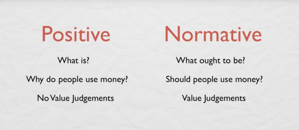
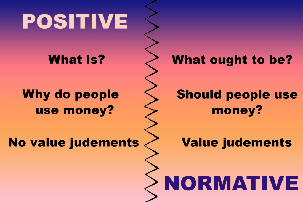
I chose the before image because the content was two contrasting ideas; however, the visual design did not do anything to emphasize that fact. The design was very “boring” and did not provide any contrast beyond the large, red type used for the titles. Therefore, there was nothing of visual interest to really grab and sustain a reader’s attention. To create my after image, I first decided I would use a jagged line dividing the two ideas, as that sort of image conveys tension between the two ideas. I chose a gradient background, which allowed me to then use opposing values for the two titles (“positive” using the light color from the bottom of the background gradient and “normative” using the dark color from the top of the gradient). I feel this use of color helped emphasize the contrast between the two ideas. I also varied the scale of the font, using a large font size for the titles and a smaller font size for the information. However, I still tried to follow the theme of visual unity by having the text in the middle of the picture follow implied lines. Overall, I feel the after image both creates more visual interest through the use of color to attract attention, and it also conveys difference between the two ideas through the use of scale and color contrast. The message from the original image has been amplified so the message is stronger.
