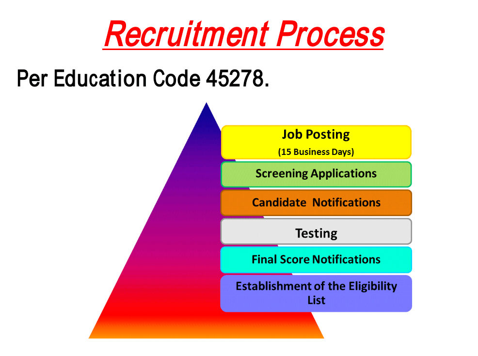
I chose the before image because I felt it lack cohesiveness as a whole. My eye was drawn to the triangle in the background with a gradient of warm colors. However, upon further inspecting the information in the before image, it was clear this background served no meaning. Further, while there is some unity in terms of having the text bubbles follow implied lines, there is little to no similarity in the colors. Overall, I felt the aesthetic experience could be improved through more intentional regard to visual unity.
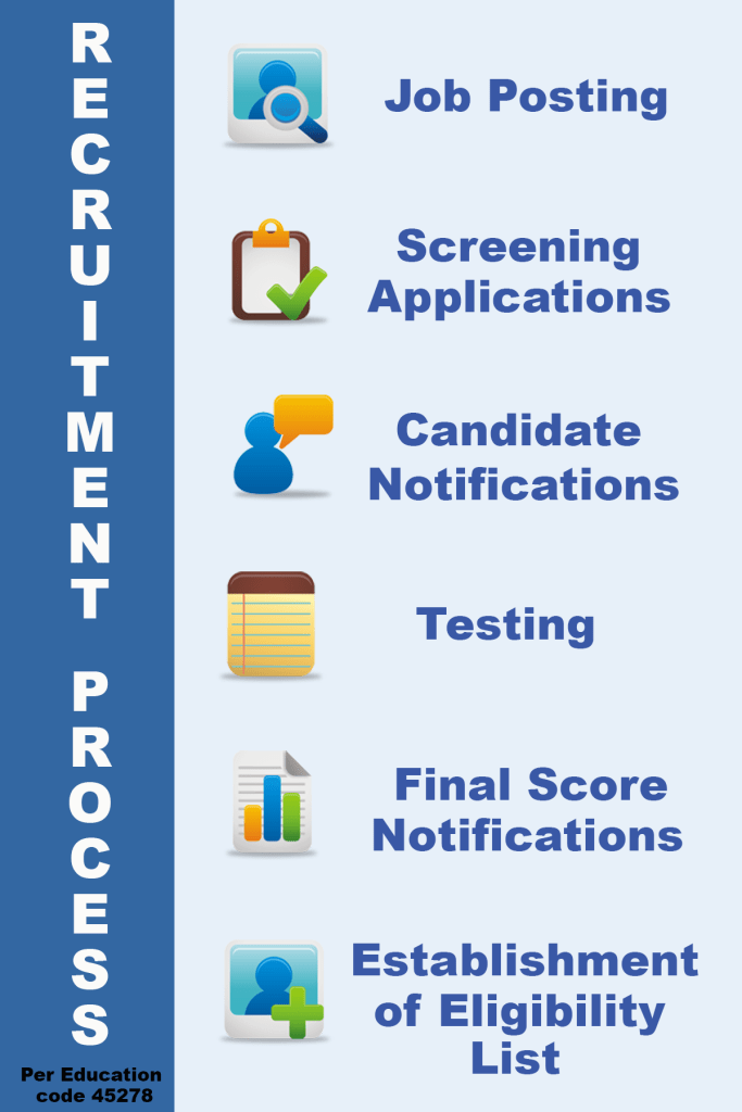
In my after image, the first issue I dealt with was the background. Since cool colors are preferred backgrounds, I chose a very light blue. I then considered other ways to reduce cognitive effort while also increasing unity. I decided using themed icons for each step could provide unity through repetition, similarity (matching color palette), and implied lines (having all icons vertically lined up, similar to the original image). I downloaded free icons from https://dryicons.com/icon-packs/coquette-part-3-icons-set, to ensure they had been designed as a similar set. I chose a blue color from these icons to create a contrasting background for my vertical title. Additionally, that blue was used as the text color for the steps next to the icons. Overall, I feel the after image results in a more aesthetically pleasing experience with more unity than the original.
