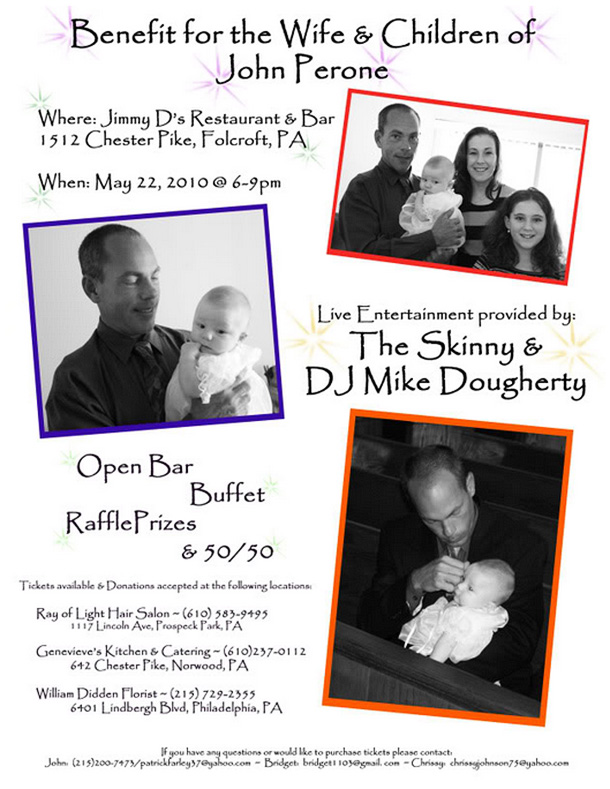
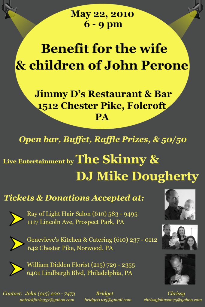
One of the first things that caught my eye about the before image was the colorful borders around the photographs. Because that was the only use of highly saturated color, it drew my eyes even more intentionally to the photos. However, the photographs were not the the main message this flyer was trying to get out – rather it wanted to attract people to the benefit for the family of the person in the photos. So, the colorful borders acted as an unintentional cue. Additionally, the typographic choices (both in typeface and sizes) made it somewhat hard to read. In the after image, I decided to focus on the benefit, so I created a color cue using a bright yellow “spotlight” to call attention to the benefit location & time. In terms of typography, I used larger font size to emphasize the benefit, and I chose a simpler typeface to make it easier to read. Additionally, since this was a benefit to help the family, I assumed making money was a goal of the benefit. To that end, I decided to add arrows as a visual cue directing the readers to the locations where they could either purchase tickets or make a donation. I decided the best place for the photographs would be next to this section, as photographs naturally draw the eye. Thus, the eye is drawn to the general location describing where to buy/donate money. Overall, I feel the after image makes correct use of visual cues so that is feels less cluttered and flows more clearly than the original.
