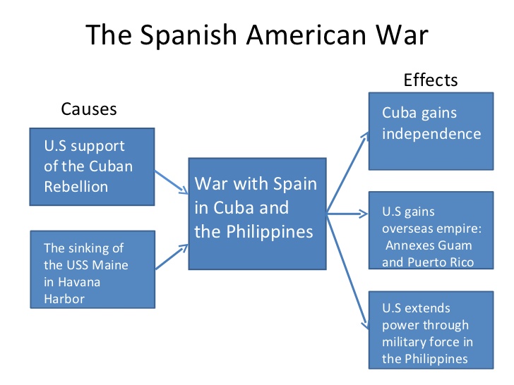
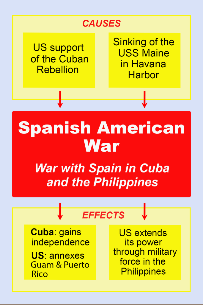
In the before image, the presentation slide does follow, perhaps unwittingly, some principles of visual hierarchy; namely, the image proceeds with content from left to right (as our eyes are accustomed to) and it also includes some arrows as visual cues (encouraging our eyes to follow from the “causes” on the left to the “effects” on the right). However, there is seemingly no thought given to the typography (all the same), nor to the use of color (the blue, cool color is not contrasted with anything to create visual interest). To remedy this, I made several changes. First, in terms of color, I decided to use red and yellow, which are shown to attract an audience more than cool colors – and also the colors of the Spanish flag thus appropriate to the content. The light blue background was chosen both because cool-colored backgrounds are better, and also because I was already using red and yellow so incorporating blue meant I was using a primary-colored triadic palette. I used a hierarchy of type using the largest on the title and then gradually using smaller font within the cause and effect slides. Also, instead of using the left to right flowchart style of the before image, I decided to change to an up and down chart, which follows the “Z” eye-scanning pattern that is very common. Additionally, the visual cues of the arrows help guide the reader down the page from cause to effect. Overall, I feel more visual hierarchy techniques are present in the after image to make the content more interesting and clear.
