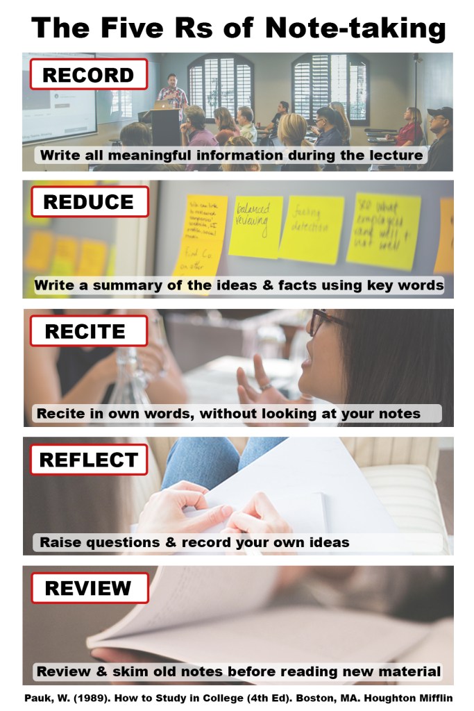
The before image lacks any images or graphics to complement its information. While it competently conveys the information, it does not entice the reader or have anything visual beyond text to help enhance the content. Because of the lack of images, my first decision was to decide what type of visual (photographs, illustrations, icons, etc) would best complement the information. To make this decision, I focused on the instructional purpose of the before image, which is a mix of “demonstrating a procedure” and “explaining a process”. I chose photographs due to their versatility. I ultimately decided to combine my photographs using a horizontal slice method, one for each of the 5 components. In addition to the slice design, I included small borders between the photos to help delineate between the 5 steps. While I did not opt for a monochromatic look with the photographs, I did decide to set the opacity of the photographs to 75%. This was to make sure the photographs were not overly dominating, and thus divert attention from the actual goal of learning the 5 steps of note-taking. By using all photographs, I brought consistency to the design, and made it more enticing for the audience than the original.
