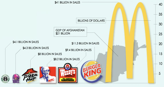
I chose a before image that, while having some visual appeal, does not adequately convey the statistics. For instance, it is hard to make comparisons from this graph due to the use of the logos as the bars (since they are different widths). In the before image Wendy’s numerical statistic is twice as many sales as Starbucks, but the logo looks 4 times as large, which can trick the eye into believing the different is more significant. Also, McDonalds is 4 times as many sales as Burger King, but its logo appears to take up 6+ times of space. All of these fast food sales are laid on top of the GDP of Afghanistan, again with an image that can confuse the eye.
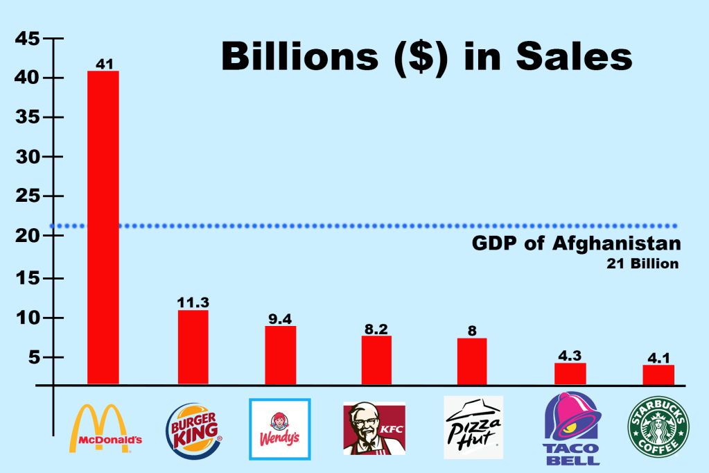
For the after image, I decided on a traditional bar graph to make comparisons easier, while still keeping the logos as labels for some visual interest. All bars are the same color since they represent the same data (sales). I made the GDP information a line in the background so it could still be used for comparison purposes but is clearly representing different information (labeled). Ultimately, the after image does more to match the design to the purpose (true comparison), and improves the readability.
