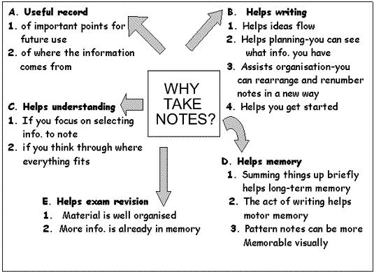
I chose the before image because it is attempting to convey a large quantity of information, but it could definitely be enhanced. Obviously, the lack of color does not attract or hold attention, and the use of the different sized and shaped arrows adds confusion for what path the eye should follow (rather than adding clarity). The topics are labeled in a certain order (A through E), but there does not seem to be a true hierarchal order, so there is no inherent reason for the labeling. All and all, the image could definitely be improved through some intentional use of enhancements.
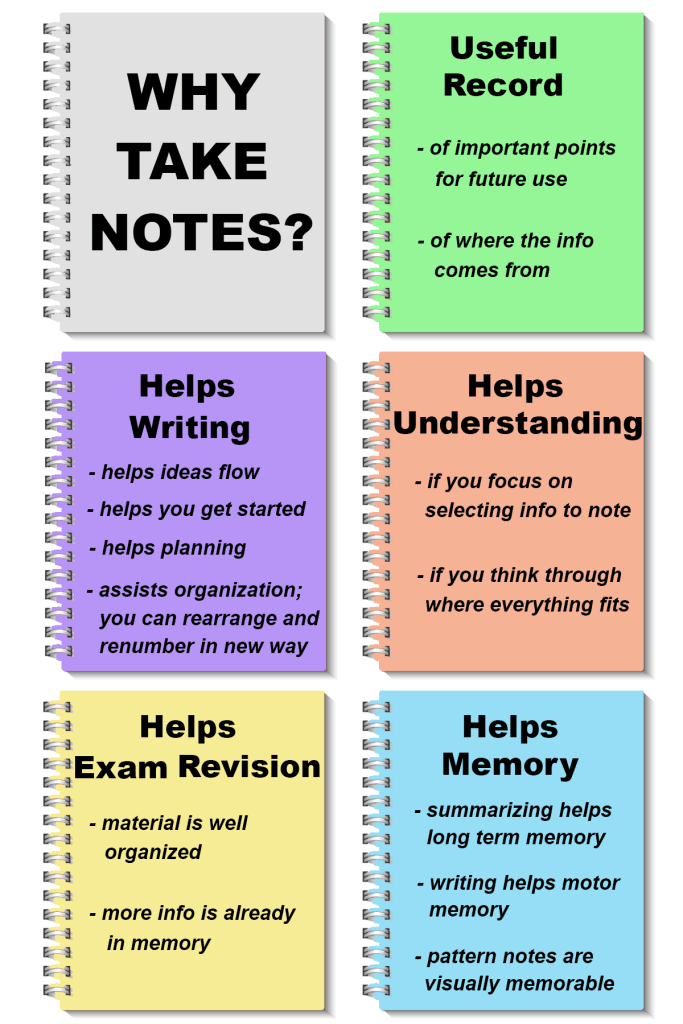
Due to the large amount of information, I decided in my after image to follow the idea of “breaking it down”. Since the brain can only process a small amount of information at once, I decided to make an effort to delineate between the different concepts in a more visual manner than just the bold text and arrows of the original. I took the basic idea of a text table, which organizes the information into rows and columns that can be focused on one at a time, and I just made it more visually interesting than a standard table. I did that by using a notebook icon (a common cultural shape for implying note-taking/studying) and various contrasting colors with the same saturation level. Within each notebook, I displayed the information associated with the heading in the original. I was also able to use larger text for the title, to grab attention. The white spaces around the notebooks serve as boundary lines so the brain can see the information “chunked” into separate regions and process them one at a time. Overall, I feel the enhancements to the after image make it both more visually appealing and easier to process.
