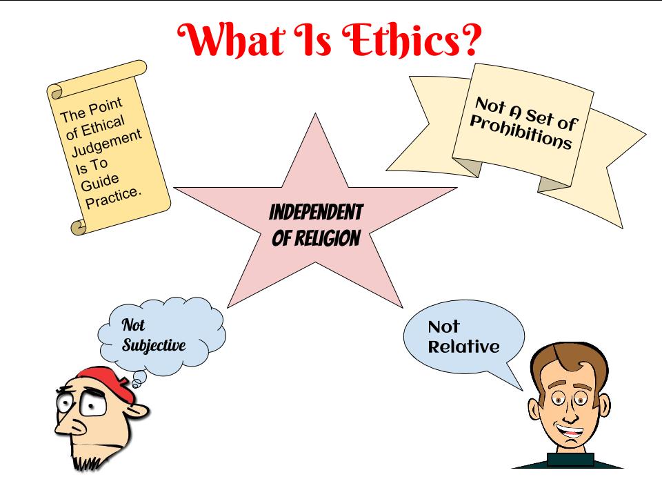
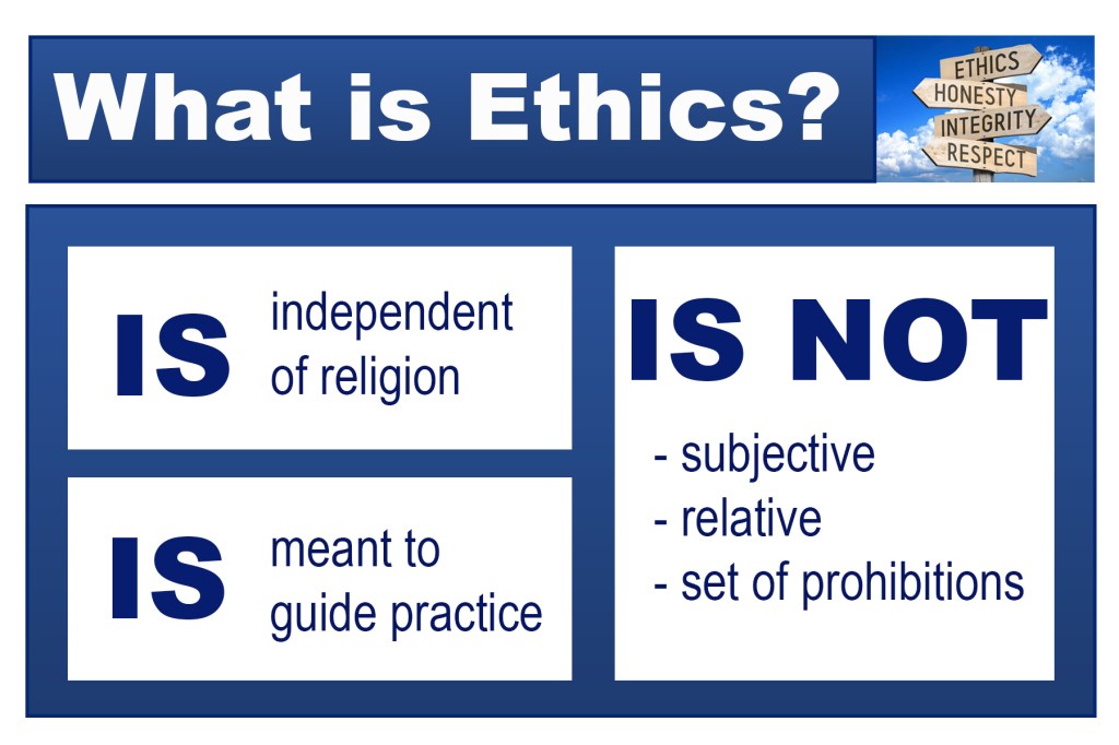
In the before image, there are several visual elements that contribute to an overall “cluttered” appearance, detracting from the purpose of the slide (to explain what ethics is). Due to this choice, there are several static regions of white space that dominate the visual field. To counteract this effect, in my after image I decided to use a grid layout to relay the same information. Due to the original image detailing both what ethics is and is not, I decided to create a modular grid form from rectangles, allowing me to emphasize the two different areas of focus (the examples and non-examples). While I did use a grid, I arranged it using an asymmetrical form to add a dynamic element to the space. In addition, I used edge alignment to make the rectangular grid forms line up in a pleasing manner. Finally, the image I added next to the title adds a concrete visual association to the topic, which was lacking in the before image.
